
Technology
Cell technology and the temperature coefficient
Datasheet temperature coefficients grouped by cell technology across our catalogue, with medians, spreads and what the gap is worth on a hot roof.
In short: on their own datasheets, PERC modules in our catalogue state a median temperature coefficient of Pmax of -0.35 %/°C, TOPCon modules -0.29 %/°C and HJT modules -0.24 %/°C. The closer to zero, the less power a module loses for each degree above 25 °C, so in a hot climate the cell technology is a fair first filter. It's a filter, not a verdict: these are manufacturers' claims, and modules inside one technology still differ.
A panel's power rating is measured with its cells at 25 °C. On a summer roof they run much hotter, and the temperature coefficient of Pmax tells you how much power goes for each degree above that reference.
Modules are sold by cell technology, and each name arrives with a story about heat. This article checks one part of that story against something we can count: does the coefficient printed on the datasheet differ by technology, and by how much? It says nothing about field performance. This data can't.
How the modules were grouped
Every catalogue module that states both a cell technology and a Pmax coefficient went into a group. Five groups are large enough to compare: TOPCon, PERC, HJT, back contact (cells with all their contacts on the rear face), and modules whose datasheet says "N-type" without naming the structure.
I kept N-type apart from TOPCon. Many of those modules are probably TOPCon, but the label doesn't say so, and merging them would be a guess.
Across the catalogue, 13,923 modules state a coefficient. Of those, 1,014 have no cell technology recorded, so they fit no group. Another 118 sit in groups I set aside: CdTe, which here is one manufacturer's product line, and BIPV and flexible modules, which describe how a module is built, not what its cells are.
Modules versus datasheets
One datasheet usually covers a ladder of power ratings that share one coefficient. Each rating is its own catalogue row, so a ten-step ladder adds ten modules and one claim.
That's why the evidence table below gives two counts. Read the datasheet count as the honest sample size: if a few long ladders were pulling a median around, it would show there.
TOPCon, PERC and HJT on paper
PERC states the steepest heat loss, HJT the gentlest, TOPCon sits between them. Look at the median first, then at the two percentile columns, which bracket the middle eight in ten modules of each group. The values are negative, so the 10th percentile is the worse end.
| Cell technology | Median (%/°C) | 10th pct (%/°C) | 90th pct (%/°C) |
|---|---|---|---|
| PERC | -0.35 | -0.37 | -0.34 |
| TOPCon | -0.29 | -0.31 | -0.28 |
| N-type, structure not stated | -0.29 | -0.30 | -0.28 |
| Back contact | -0.26 | -0.29 | -0.26 |
| HJT | -0.24 | -0.26 | -0.24 |
Compare the 90th percentile of one row with the 10th percentile of the row below it. Where the two ranges don't touch, the technology label tells you more than any single datasheet inside the group.
TOPCon and the unspecified N-type group sit close together. That fits the guess that many "N-type" modules are TOPCon under another name. The label still can't confirm it.
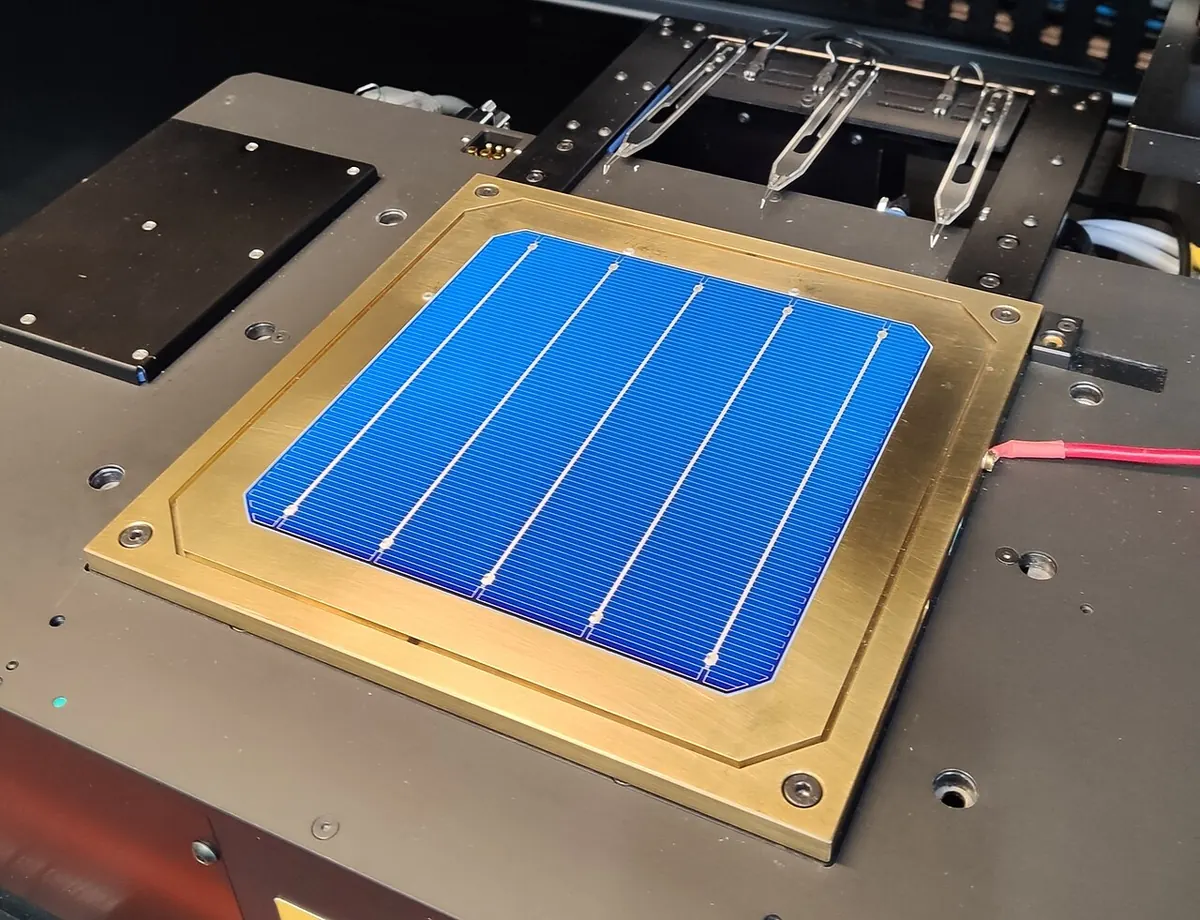
HJT cells put thin layers of amorphous silicon on both faces of a crystalline wafer. The photo below shows one on a measurement stage.

How much evidence each group rests on
Before you trust a gap, check what stands behind it. The column to watch is datasheets, not modules.
| Cell technology | Modules | Datasheets |
|---|---|---|
| PERC | 4,283 | 850 |
| TOPCon | 5,721 | 1,136 |
| N-type, structure not stated | 1,656 | 364 |
| Back contact | 434 | 93 |
| HJT | 697 | 131 |
HJT and back contact rest on far fewer datasheets than PERC and TOPCon, so a handful of manufacturers can move their medians more. Each still draws on many separate files from several makers.
Three distributions, one module from each
The three charts share one horizontal axis, so you can compare their shapes directly. Under each sits one real module from that group.
I picked them by a fixed rule, not by brand: a module with all four scorecard figures whose coefficient sat at its group's median when this was written. Nobody paid for the spot. The verdict on each card compares the module with the whole catalogue, so a perfectly middling PERC module can still read as weak overall.
PERC first, with its median at -0.35 %/°C over 4,283 modules.
The numbers behind the chart
| Temperature coefficient of Pmax, PERC (%/°C) | Modules |
|---|---|
| <-0.40 | 74 |
| -0.40 to -0.38 | 73 |
| -0.38 to -0.36 | 384 |
| -0.36 to -0.34 | 2,217 |
| -0.34 to -0.32 | 1,338 |
| -0.32 to -0.30 | 84 |
| -0.30 to -0.28 | 80 |
| -0.28 to -0.26 | 33 |
| -0.26 to -0.24 | 0 |
| -0.24+ | 0 |
Scorecard for this module: open its page on ComparePV.
TOPCon, with a median of -0.29 %/°C over 5,721 modules.
The numbers behind the chart
| Temperature coefficient of Pmax, TOPCon (%/°C) | Modules |
|---|---|
| <-0.40 | 0 |
| -0.40 to -0.38 | 4 |
| -0.38 to -0.36 | 5 |
| -0.36 to -0.34 | 145 |
| -0.34 to -0.32 | 158 |
| -0.32 to -0.30 | 323 |
| -0.30 to -0.28 | 4,382 |
| -0.28 to -0.26 | 571 |
| -0.26 to -0.24 | 121 |
| -0.24+ | 12 |
Scorecard for this module: open its page on ComparePV.
HJT, with a median of -0.24 %/°C over 697 modules.
The numbers behind the chart
| Temperature coefficient of Pmax, HJT (%/°C) | Modules |
|---|---|
| <-0.40 | 0 |
| -0.40 to -0.38 | 2 |
| -0.38 to -0.36 | 0 |
| -0.36 to -0.34 | 5 |
| -0.34 to -0.32 | 0 |
| -0.32 to -0.30 | 1 |
| -0.30 to -0.28 | 12 |
| -0.28 to -0.26 | 6 |
| -0.26 to -0.24 | 253 |
| -0.24+ | 418 |
Scorecard for this module: open its page on ComparePV.
Why the groups might differ
Heat costs a solar cell voltage, and voltage is where most of the loss comes from. As the cell warms, its open-circuit voltage drops noticeably while its current rises only a little, so their product, the power, falls.
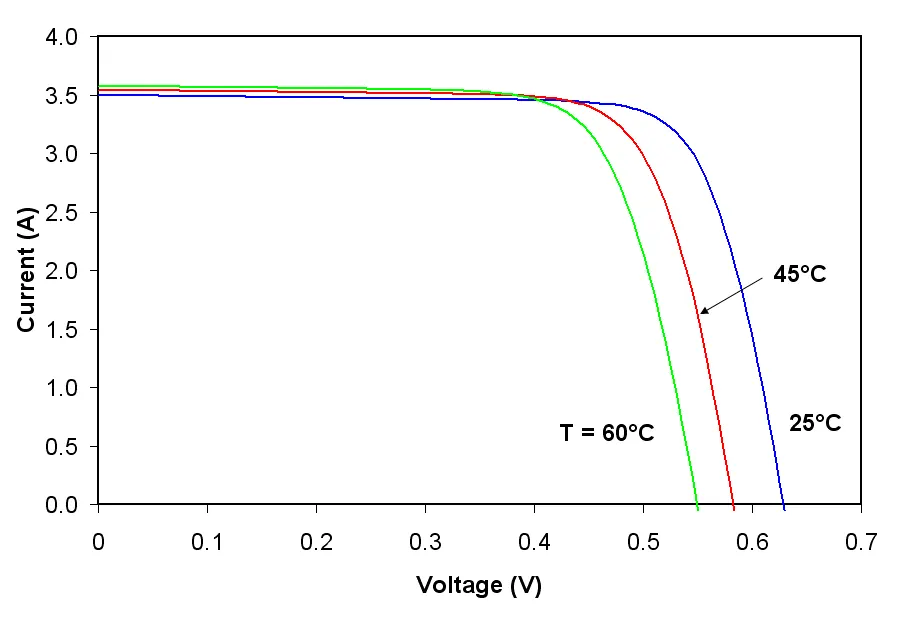

PVEducation adds one documented thread that may tie this to technology: cells with a higher voltage are less affected by temperature. Whether that explains the table, this data can't show. I compared coefficients, not cell voltages, and a datasheet coefficient bundles every effect into one number.
The thread runs through the cell structure. In the figure below, turn up the losses at the rear contact and watch voltage and heat loss move against each other.
Inside the cell: PERC, TOPCon and HJT
Switch between the three cells, select a layer to see what it does, and turn up the losses at the rear contact to see what happens to the voltage.
How this is computed
The drawing is a schematic cross-section, not to scale: the wafer is many times thicker than every other layer put together, and the thin films are drawn thick enough to select. The layer descriptions are textbook accounts of each structure as it is usually made; manufacturers vary the details.
Recombination at the rear contact is an ordinal scale from very low to very high, not a measurement. Each cell starts where its structure puts it: PERC high, because metal meets silicon at its rear openings; TOPCon low, because the tunnel oxide and poly-silicon sit between them; HJT very low, because amorphous silicon passivates both faces. The animation loses that many of its pairs at the rear as sparks.
Voc and heat loss are compared with a PERC cell as built, one arrow per step on the scale. The direction is textbook physics: Voc rises with the logarithm of the ratio of light-generated to recombination current, so less recombination raises it, and the share of Voc a cell loses per degree falls as Voc rises. The arrows give only a direction and an order. A real cell's voltage also depends on its wafer, front surface and emitter, which the slider leaves alone, so the figure stops being true as a way to rank two real modules: their datasheets do that.
Illustrative model, not a measurement.
So read the table as what manufacturers state, grouped by the technology they name. It's an observation, not a proof of why.
What a better coefficient is worth on a hot roof
The gap only matters while the cells are hot. Here is one such hour, with two round coefficients picked for easy arithmetic; hold them against the medians above yourself.
Take a 430 W module whose cells reach 60 °C, which is 35 degrees above the rating condition (60 - 25). The last column is what you get.
| Coefficient | Loss at 35 degrees | Watts lost | Output |
|---|---|---|---|
| -0.35 %/°C | 35 × 0.35 = 12.25 % | 430 × 0.1225 = 52.7 W | about 377.3 W |
| -0.29 %/°C | 35 × 0.29 = 10.15 % | 430 × 0.1015 = 43.6 W | about 386.4 W |
The module closer to zero delivers about 9 W more, roughly 2 % of its rating.
The figure below starts both modules at the catalogue medians for TOPCon and PERC. Move the air temperature and watch where the gap opens.
What a hot roof does to two modules
Set the air temperature and the sunlight, give two modules their datasheet figures, and watch the cells heat up and the output bars move apart.
How this is computed
Cell temperature follows the NOCT method: Tcell = Tair + (NOCT - 20) / 800 × G, with G the sunlight on the module in W/m². NOCT is measured at 800 W/m², 20 °C air, 1 m/s wind and an open back, so the rise above the air is scaled from that test.
Output is the rating scaled by sunlight and by temperature: P = rating × G / 1000 × (1 + coefficient / 100 × (Tcell - 25)). It is the same calculation as the heat yield comparison tool, run once for each module.
The sentence under the readout splits the gap in two: B's output with A's coefficient at B's own cell temperature separates what the coefficient did from what the cooler or hotter cells did.
The model is a steady state with NOCT wind. A roof-mounted module with little air behind it runs hotter than its NOCT suggests, and wind cools it. It ignores weak-light losses, the spectrum, dirt and the inverter, and treats the coefficient as a straight line, which datasheets only state around 25 °C. It compares two modules under the same conditions; it is not a yield forecast.
Illustrative model, not a measurement.
On a cool morning both modules sit near their rating and the difference shrinks towards zero. So a 2 % gap in the hottest hour is not a 2 % gap in yearly energy; how much it adds up to depends on your climate and how well the array is ventilated. How to choose panels for a hot climate sets the coefficient next to the NOCT for one hot hour.
What this means when you buy
In a hot climate, start with the technology. Picking from a group with a median closer to zero moves the odds your way before you open a single datasheet.
Then stop trusting the group. Two modules sold under the same name can differ, so once you're down to two candidates, compare their own datasheets, not the median.
And keep the coefficient in proportion. Price per watt, efficiency and degradation also shape what a system earns. In a mild climate I wouldn't pay much extra for a better coefficient alone. To see whether a few percent of hot-hour yield changes your payback, put the numbers into the solar payback calculator.
If you want the modules at the far end of the spread, the catalogue picks them by the rule in the caption:
Top 3 by the smallest Pmax temperature coefficient, one module per datasheet, among 12,632 modules of 300 W or more with a stated cell technology and a stated Pmax temperature coefficient, as of the last catalogue sync.
Scorecard for this module: open its page on ComparePV.
Scorecard for this module: open its page on ComparePV.
Scorecard for this module: open its page on ComparePV.
Caveats
Every number here is a manufacturer's claim, measured on sample modules under controlled conditions. We haven't tested any module ourselves, and two modules with the same printed coefficient can behave differently on a roof.
The coefficient is a linear model around standard test conditions: 1000 W/m², the AM1.5 spectrum and 25 °C. Real arrays see changing irradiance, wind and mounting, so the worked example isolates temperature rather than predicting output.
The technology label is whatever the datasheet states. It can be broad ("N-type") or missing, and modules without one are left out rather than guessed. If the unlabelled modules differ systematically from the labelled ones, the medians wouldn't show it.
Finally, the catalogue counts what is listed, not what is sold. Many datasheets don't mean many installations.
Figures and denominators
How the figures above were computed. Every figure is recomputed from the catalogue and the live shop offers when the page is served, and each one counts only the modules or offers that publish the value.
Every figure on this page is computed from the same pool as the rest of the site: the modules listed in our catalogue (the rankings view, which keeps only modules with a power rating and a page). A module counts toward a technology when its datasheet states a temperature coefficient of Pmax between -1 and 0 %/°C and its cell technology is recorded as one of the five groups in the table. Values outside that range are data entry errors, not datasheet claims.
The median, 10th and 90th percentiles are continuous percentiles of the signed coefficient within each group. Because the values are negative, the 10th percentile is the worse end and the 90th percentile the better one.
"Modules" counts catalogue rows, one per power rating. "Datasheets" counts distinct datasheet files in the same group. A single datasheet usually covers a ladder of several power ratings with one shared coefficient, so the datasheet count is the number of independent manufacturer claims a group rests on.
Of the 13,923 modules with a coefficient in range, 1,014 have no cell technology recorded and 118 sit in groups left out of the comparison: CdTe, which in our catalogue comes from a single manufacturer, and BIPV and flexible modules, which are form factors rather than cell technologies.
All 3 figures on this page and what each counts
| Figure | Computed over |
|---|---|
| Modules with a Pmax temperature coefficient | 13,923 modules |
| Modules with a coefficient but no cell technology | 1,014 modules |
| Modules with a coefficient in a group outside the comparison | 118 modules |